Amsterdam Rainproof approached us with a clear challenge: How do we motivate the people living in Amsterdam to remove excess tiles and make their gardens rainproof? Rainproofing ensures that water has somewhere to go. When a garden is fully paved, the ground can’t absorb anything, which leads to flooding.
This campaign was developed together with Katriina Mansikka. We handled the research and strategy collaboratively, explored multiple directions and then we each created our own executions based on the chosen concept.
Case: Amsterdam Rainproof, Campaign Design
Client: Utrecht University of Applied Sciences (HU)
Year: 2023
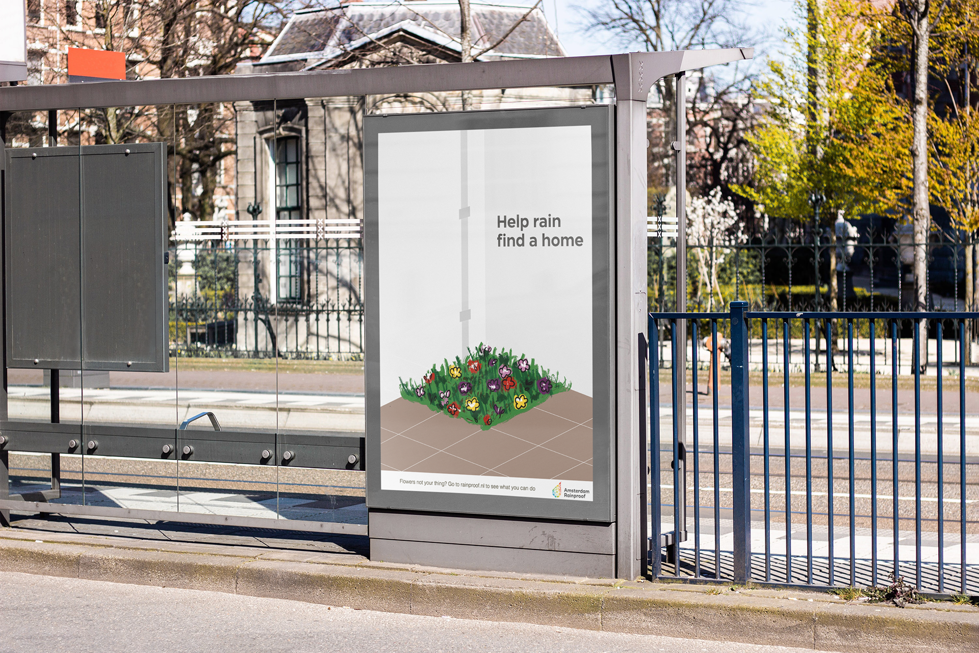
Final posters
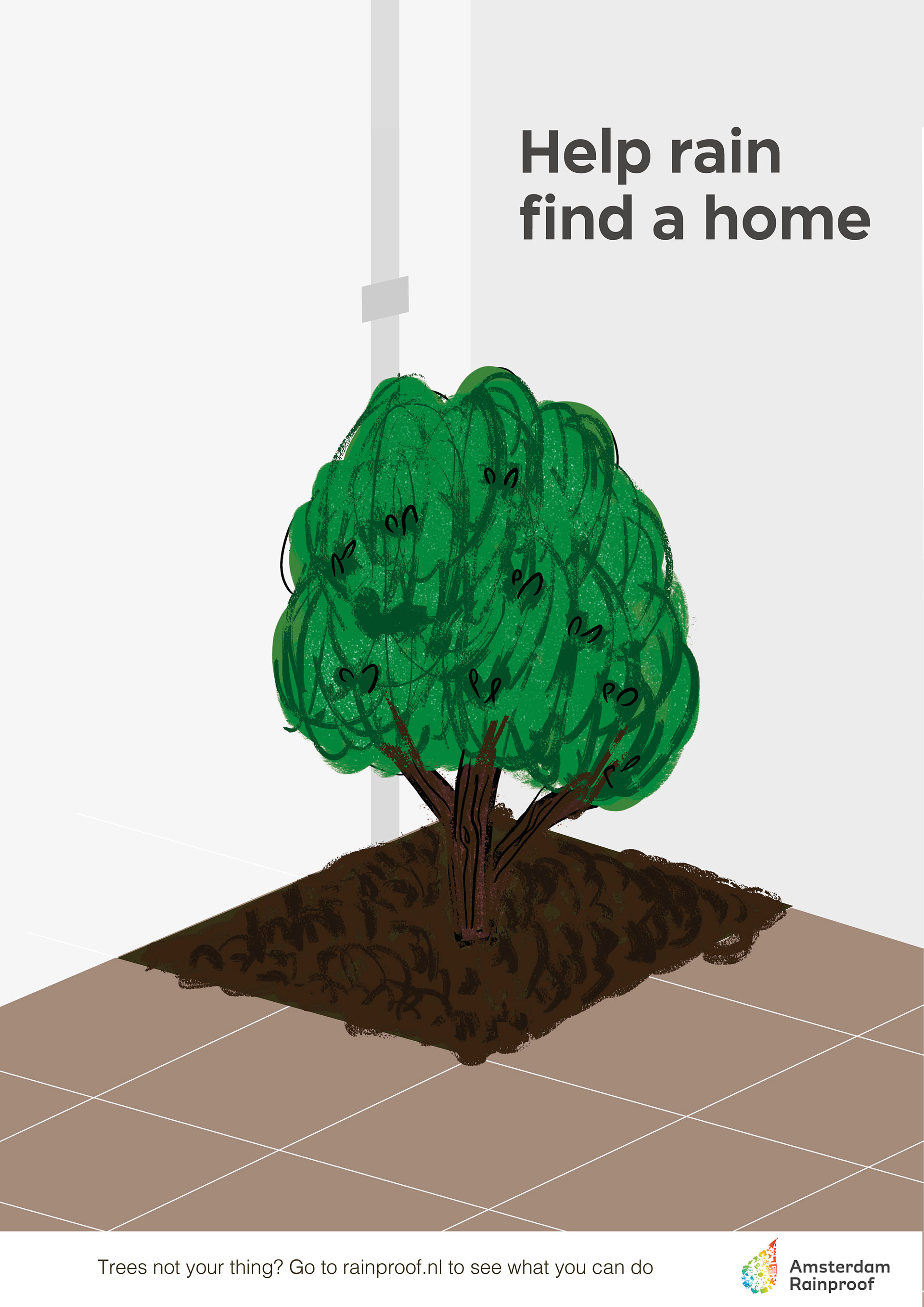
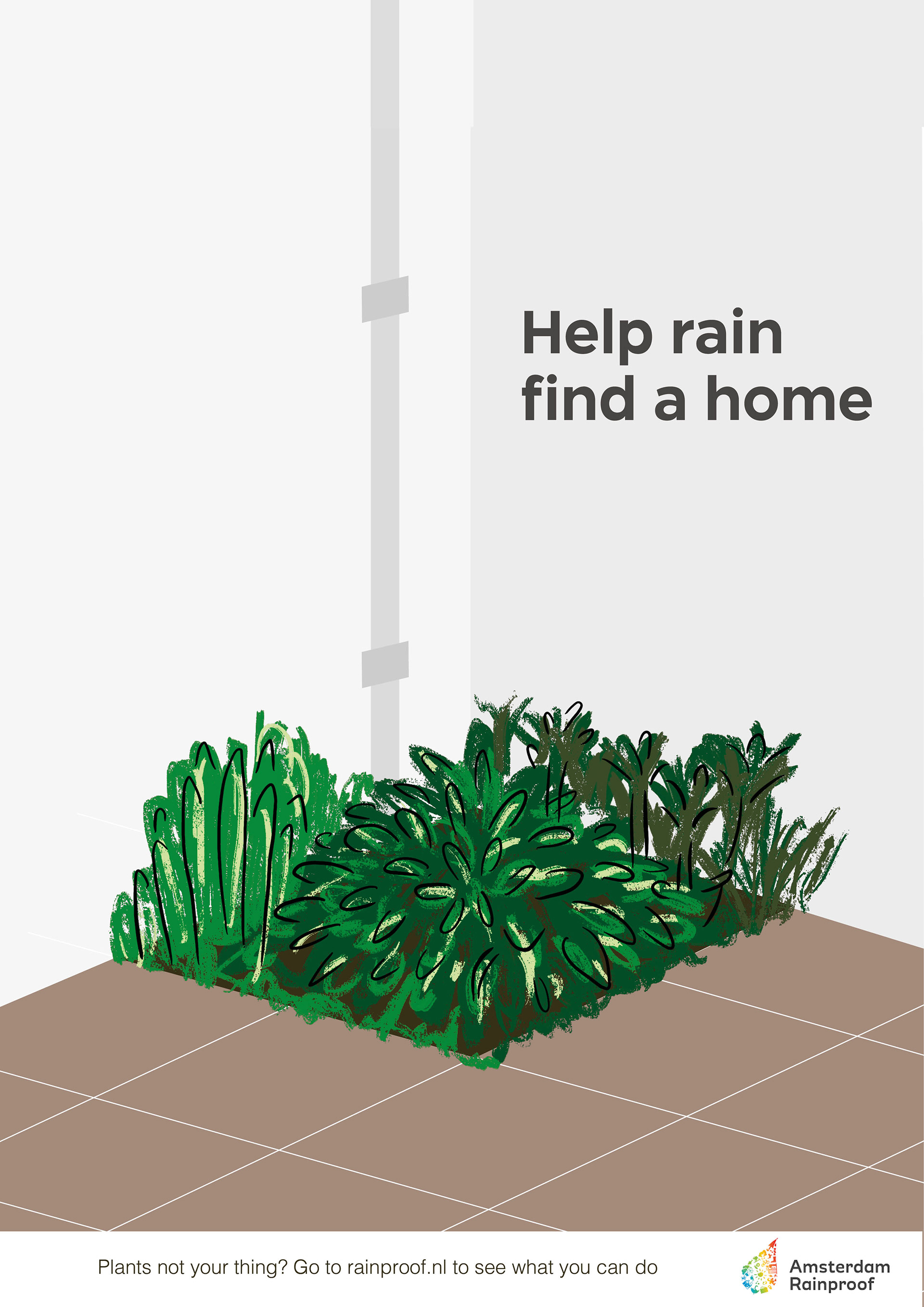
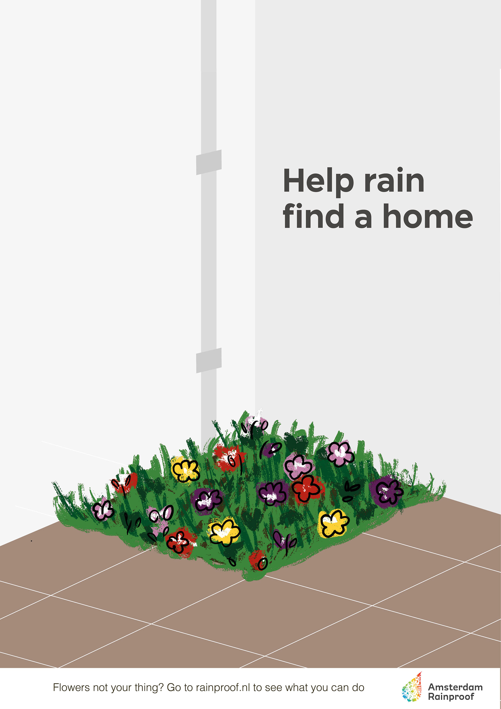
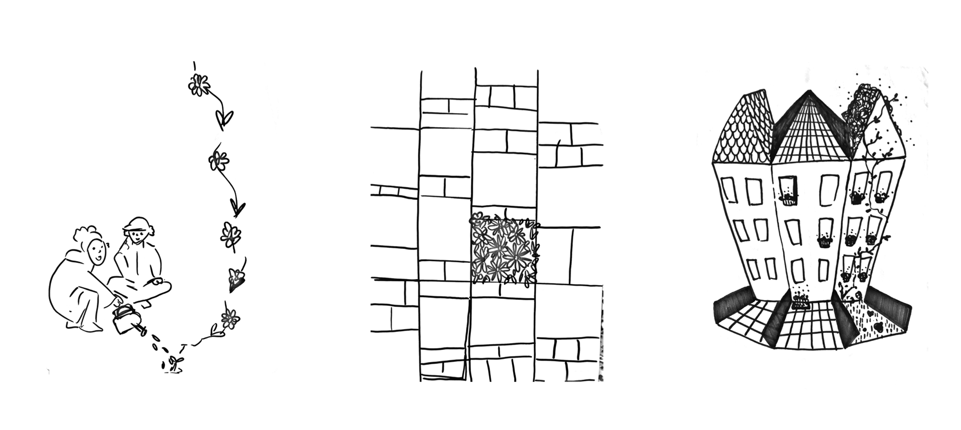
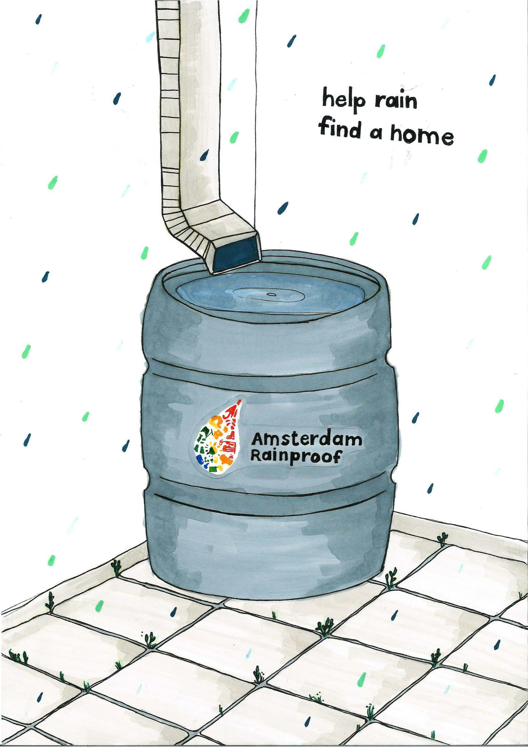
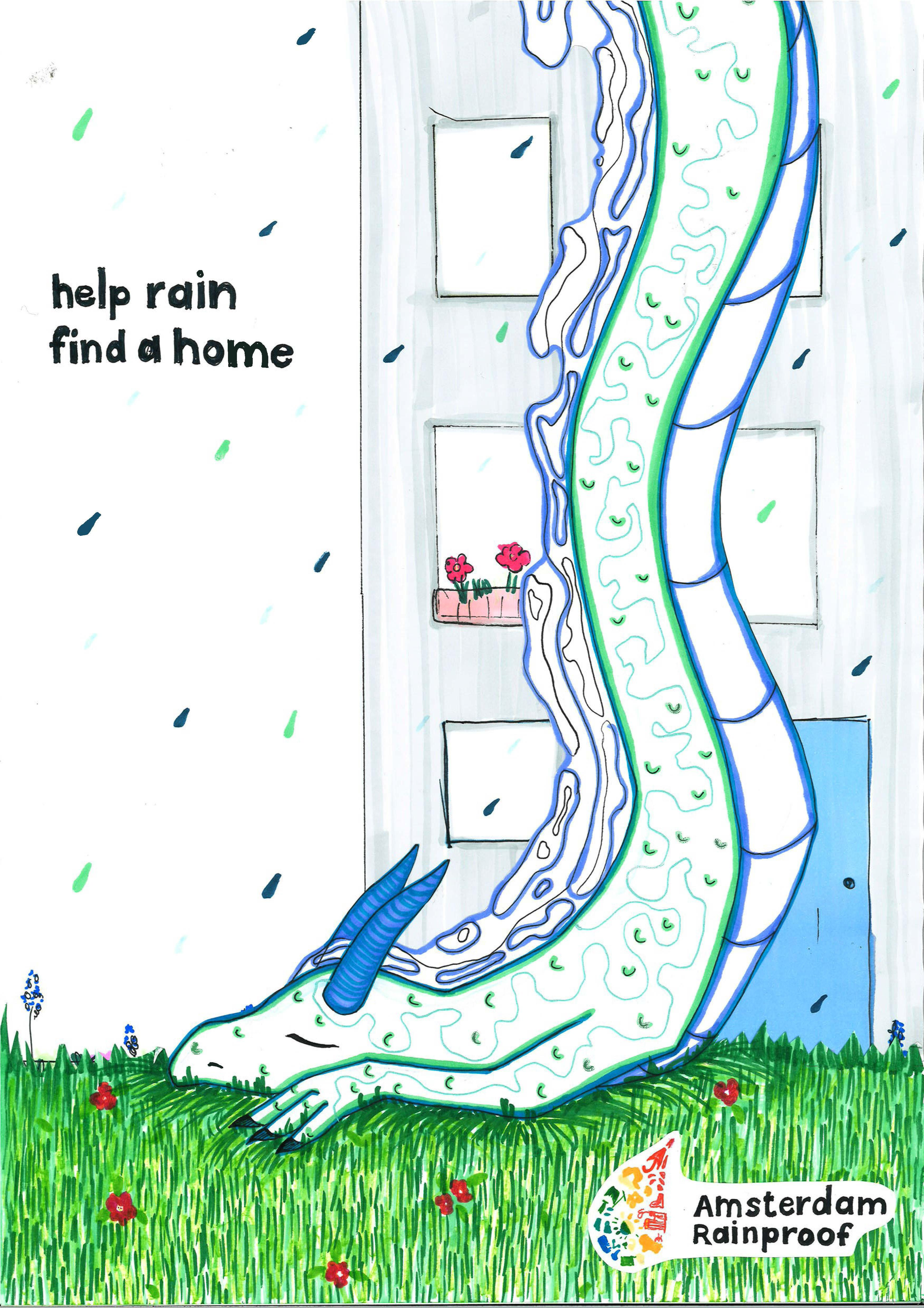
Chosen concept: Help rain find a home.
Challenge people to help the rain.
Our core insight:
People don’t see rainfall as a problem, and they don’t think that their tiled garden is a problem for the drainage of rain.
People don’t see rainfall as a problem, and they don’t think that their tiled garden is a problem for the drainage of rain.
So we built a concept that reframes rain as something relatable and worth caring for. Instead of positioning rain as an enemy to fight, we deliberately chose a more empathetic approach:
Invite people to help the rain, not battle it.
Invite people to help the rain, not battle it.
The goal was to lower the psychological barrier. Asking someone to remove tiles sounds like work. Showing them how they can help in small, accessible ways makes it feel doable.
I illustrated the flowers, plants and trees in a simple sketch-like style. It reinforces the idea that rainproofing your garden is easy. The drawings look light, playful, and doable by anyone, mirroring the simplicity of the actual action.
Process
This part is with Katriina Mansikka. We wanted to change people's behaviour and attitude towards rainproofing.
3 concepts
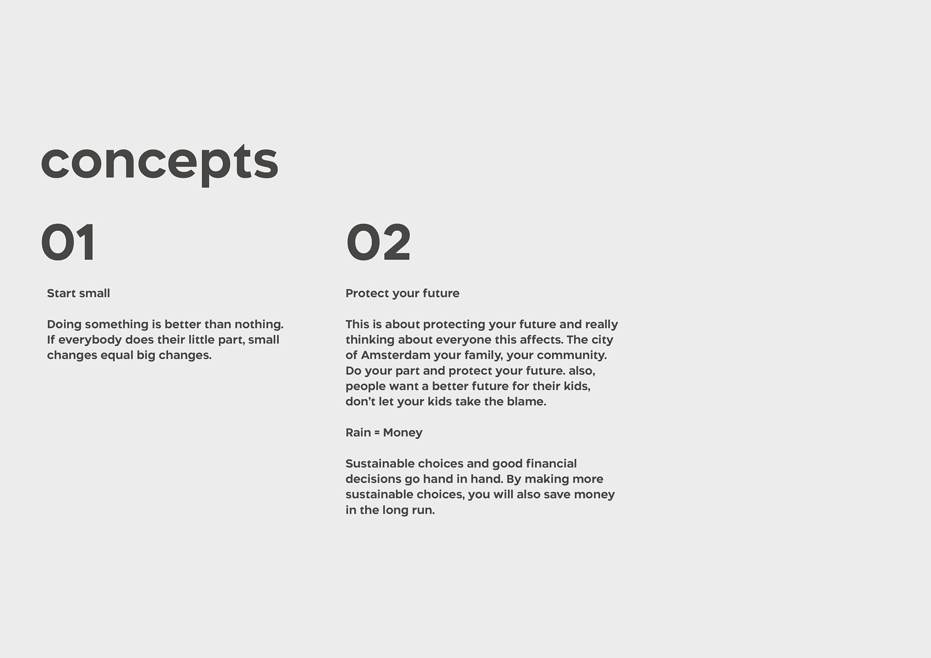
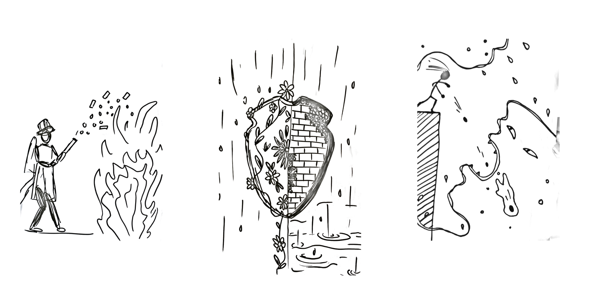
01. You can't fight water with stone
02. Start small
03. Grow Together
You can't fight water with stone
We initially explored a heroic, “fight the water” angle. After testing the idea, we chose to step away from it because it didn’t match the reality of rainfall in the city. Rain isn’t the villain: asphalt and tiles are. The Rain needs to have a place to go.
We also refined the message to make it clear at first glance. Our early poster ideas were visually heavy, and we made a conscious decision to simplify. Good design hits immediately, and our final direction keeps the message focused and intuitive.
Final executions with Katriina Mansikka
As a duo, we presented “Help rain find a home.”
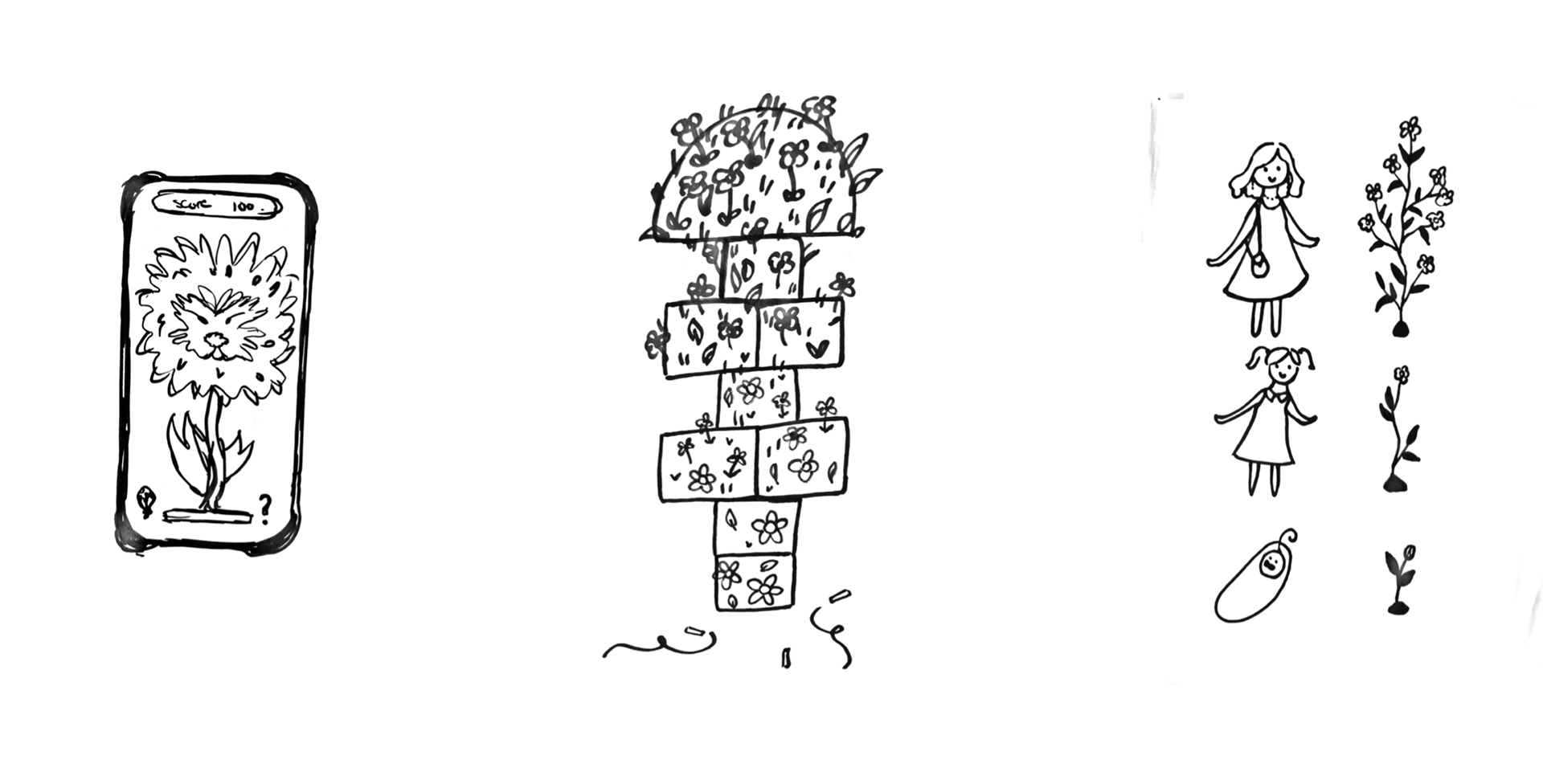
The concept uses personification to make rain feel tangible. Now it’s something kids can connect with, and adults can understand instantly. We experimented with a rain spirit character as a way to build sympathy and emotional connection.
The concept uses personification to make rain feel tangible. Now it’s something kids can connect with, and adults can understand instantly. We experimented with a rain spirit character as a way to build sympathy and emotional connection.
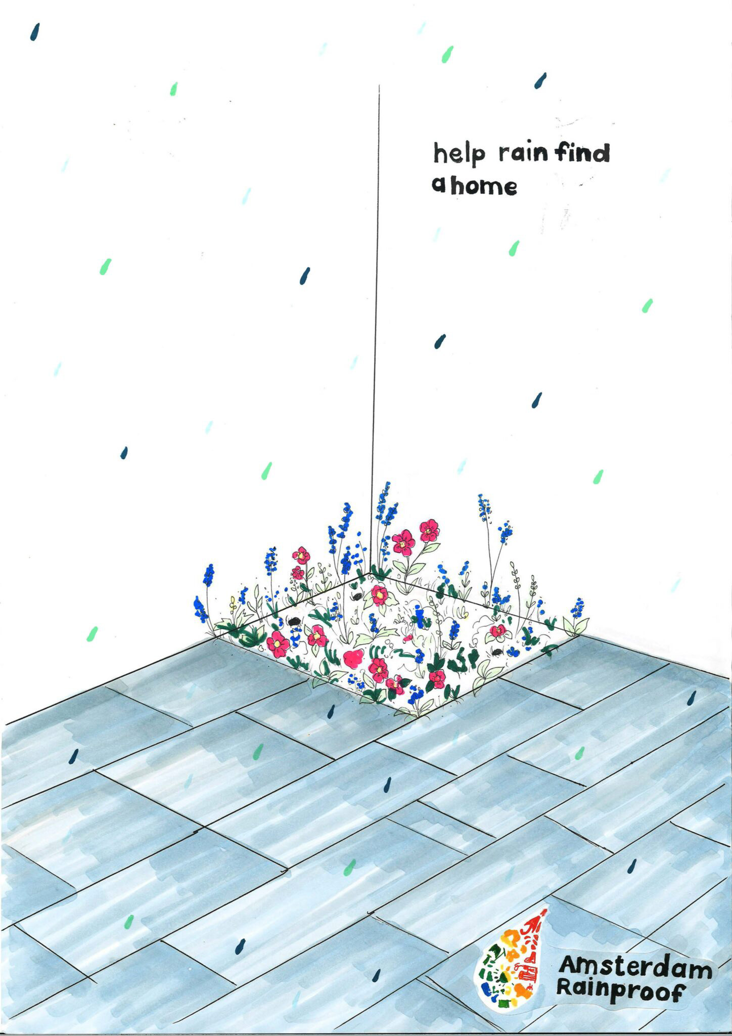
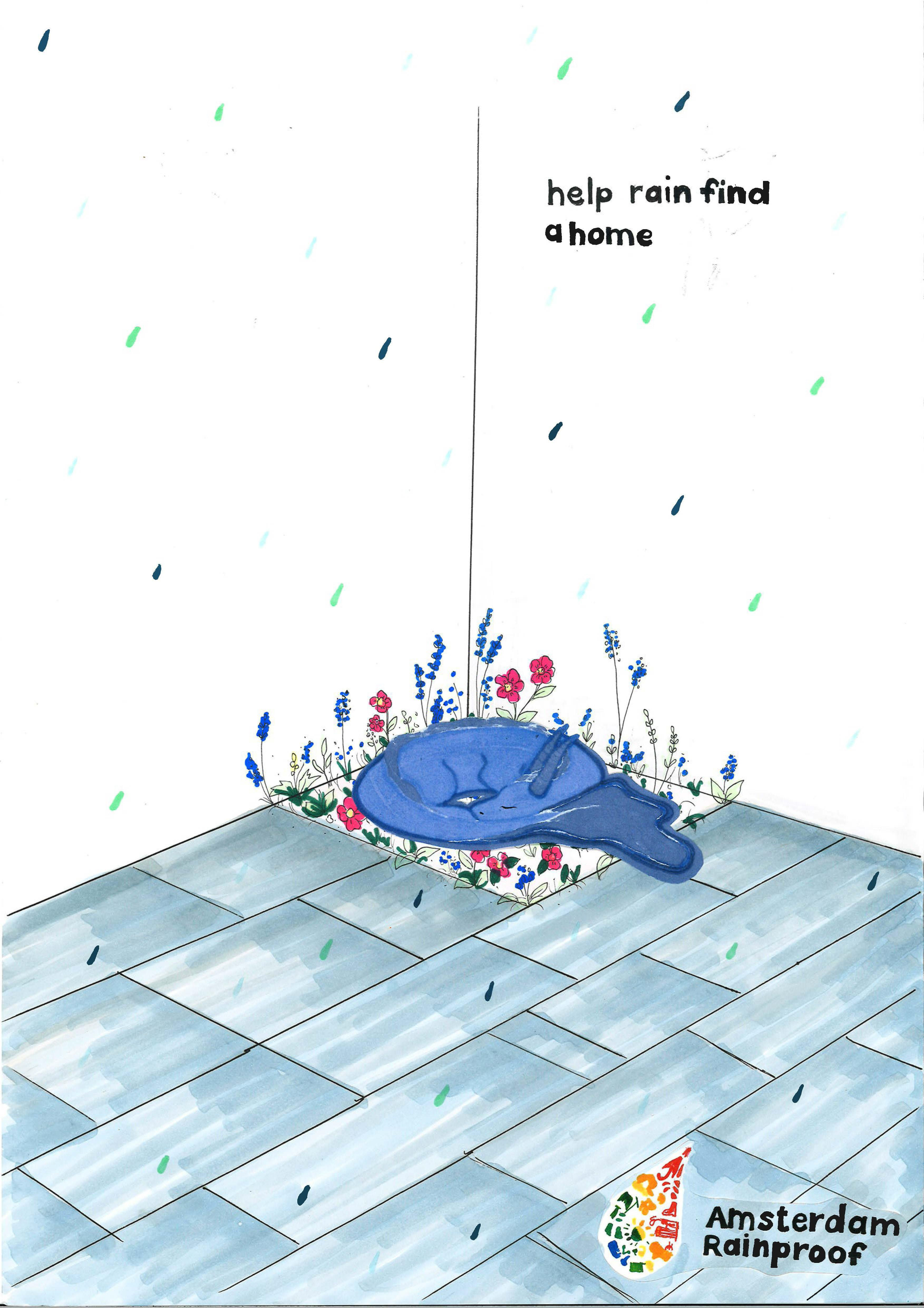
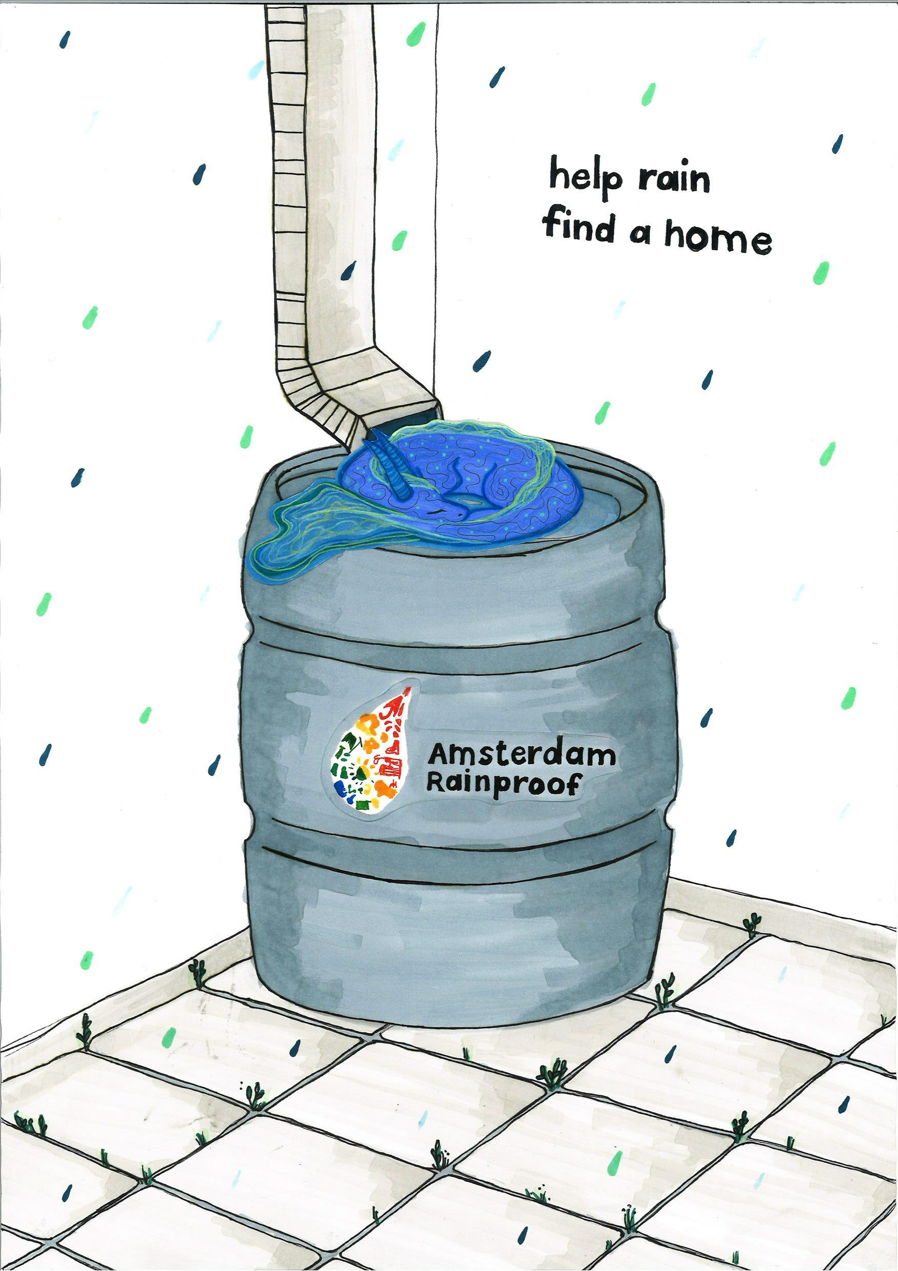
All sketches had to be made by hand, without digital tools. Katriina created the outlines and I wrote the copy and coloured the first two designs. We tested versions with and without the spirit.
After feedback, we decided to remove the spirit. Not everyone recognised it as a rain-based character, and the focus needed to stay squarely on the garden itself. The rain barrel also didn’t align closely enough with the brief.
I moved forward with the first visual, and based my final concept on help rain find a home.