Case: Focus on a specific discipline within the work field of Campaign Design.
I chose illustration at first, and that evolved into copywriting.
Year: 2023
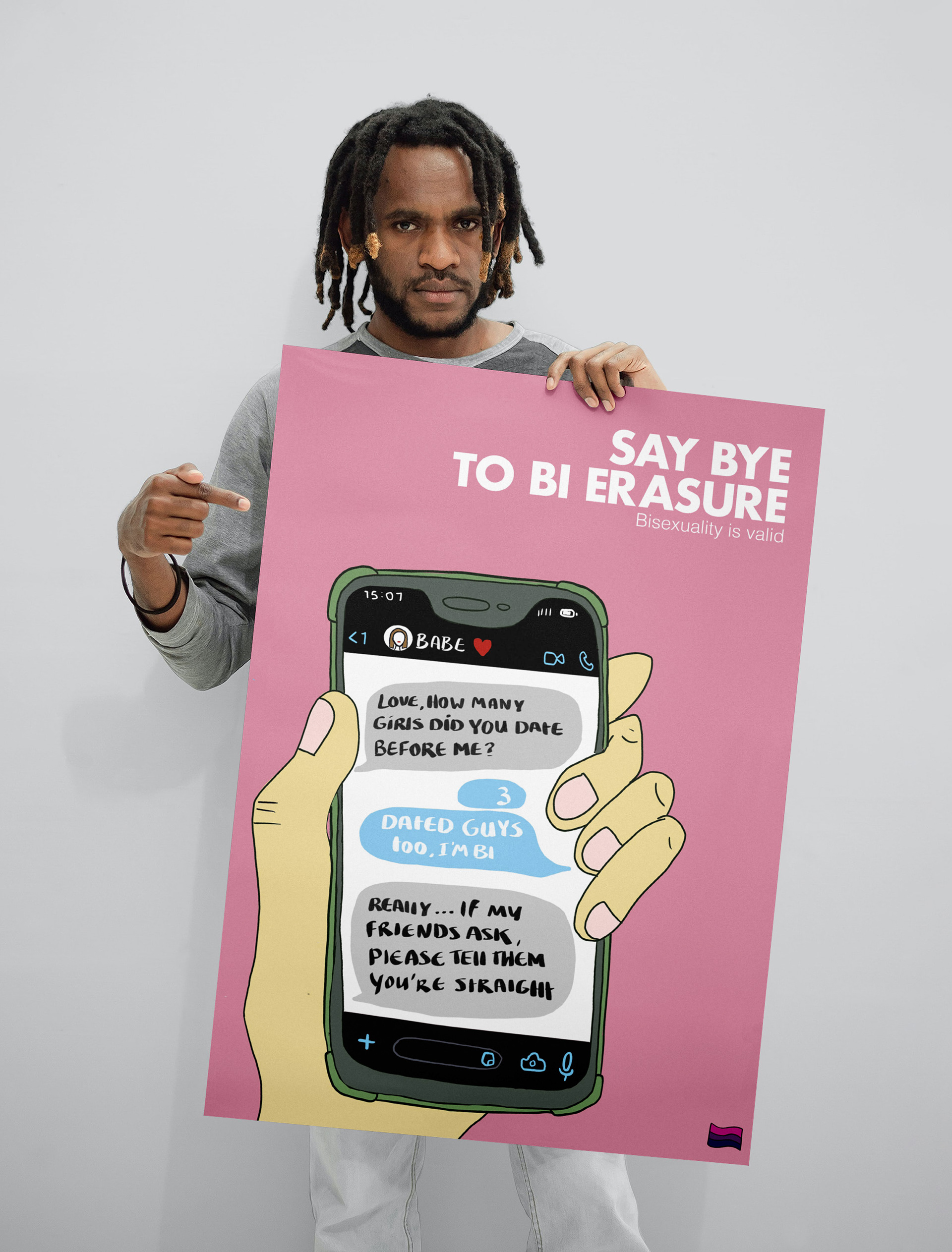
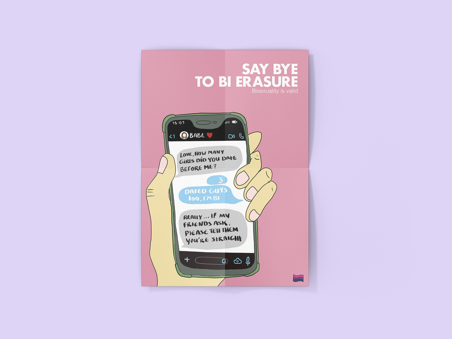
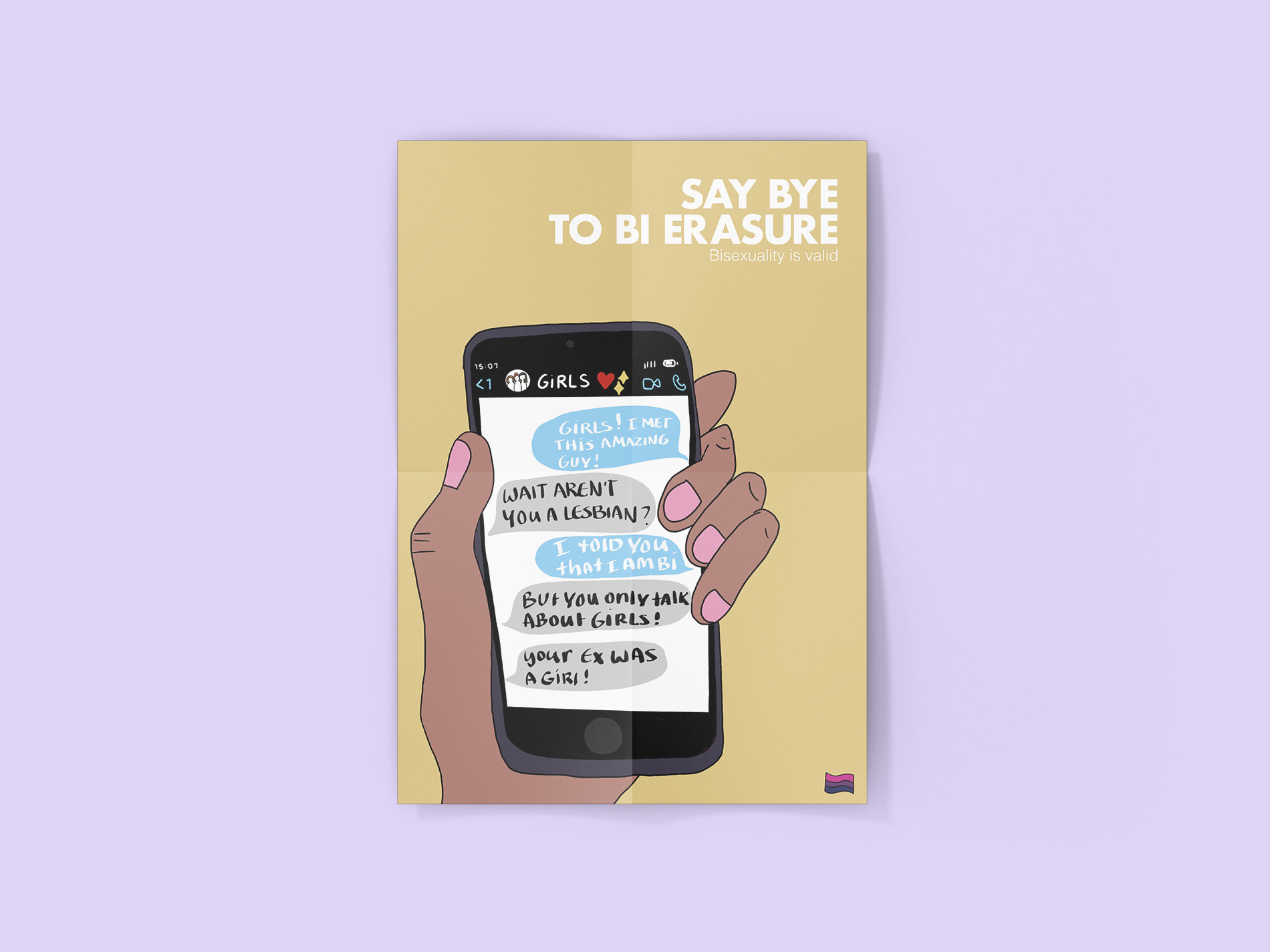
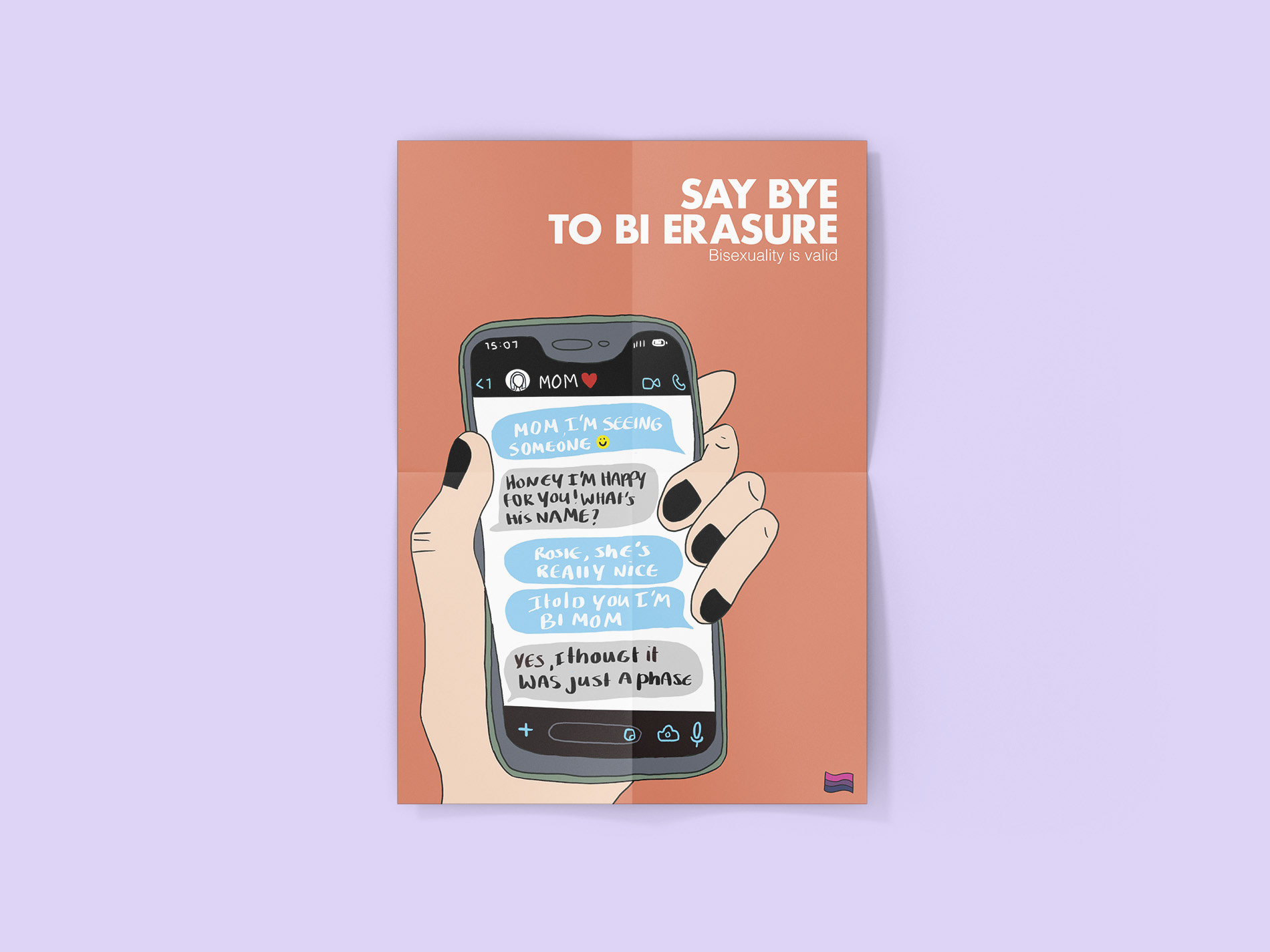
My final concept is called Bi Erasure.
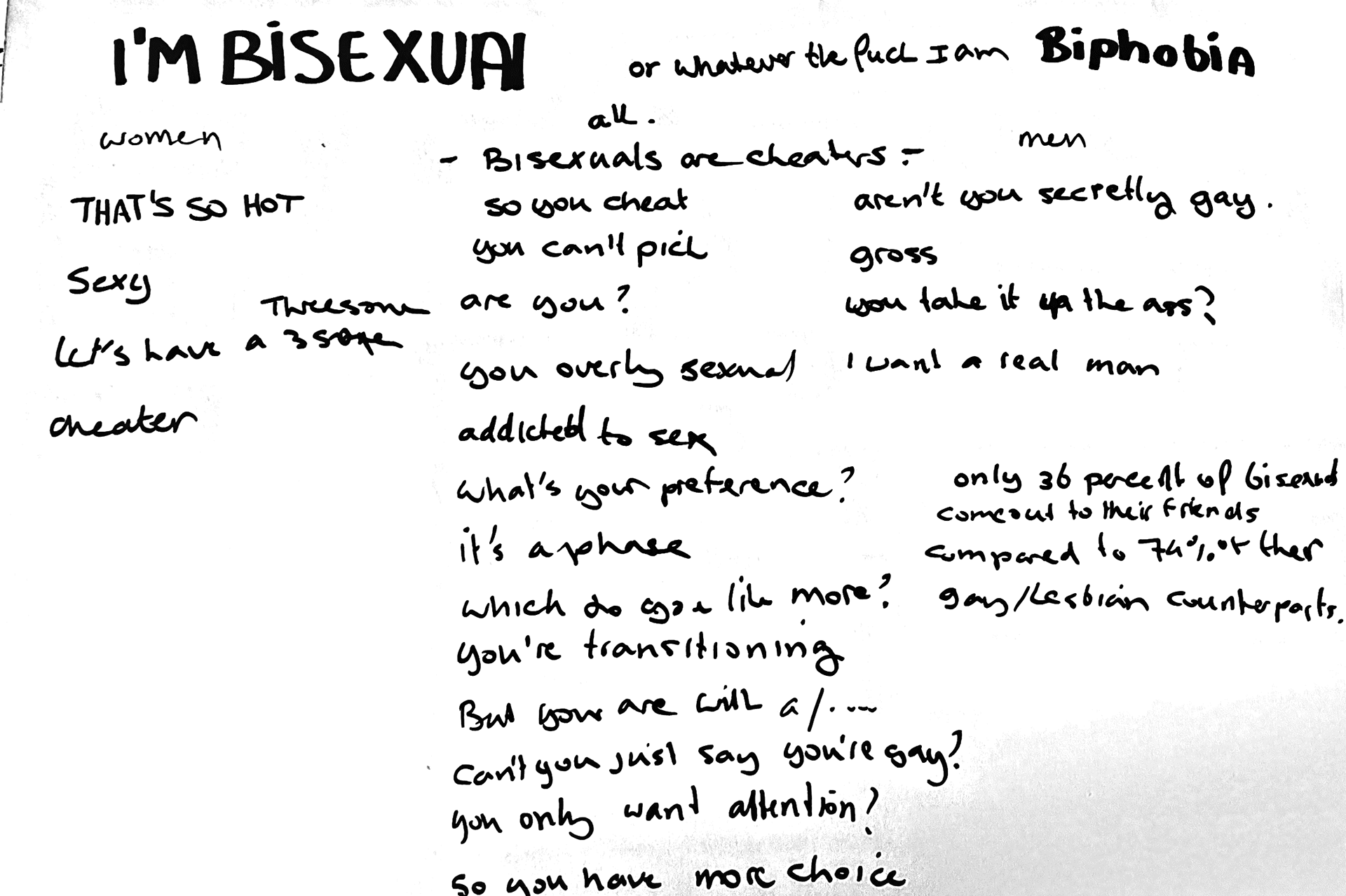
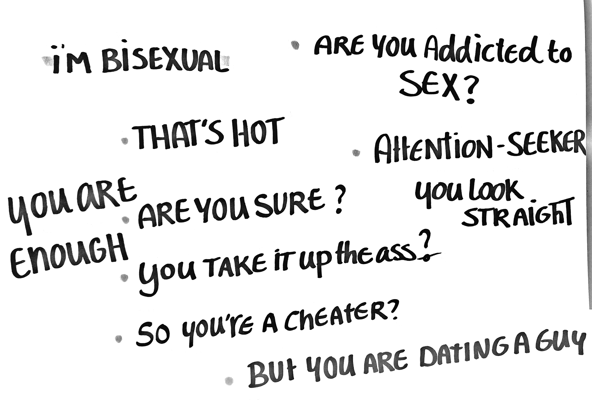
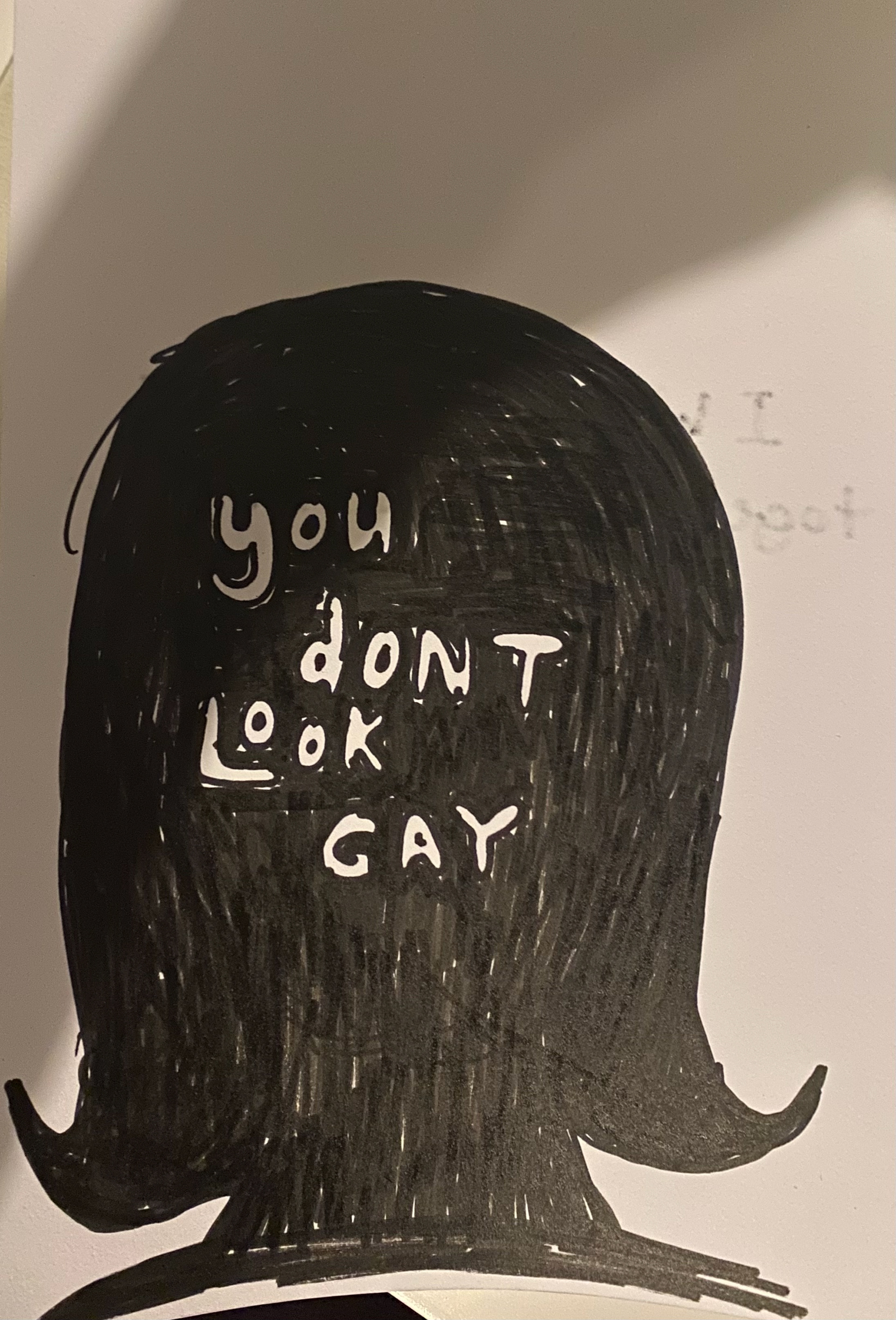
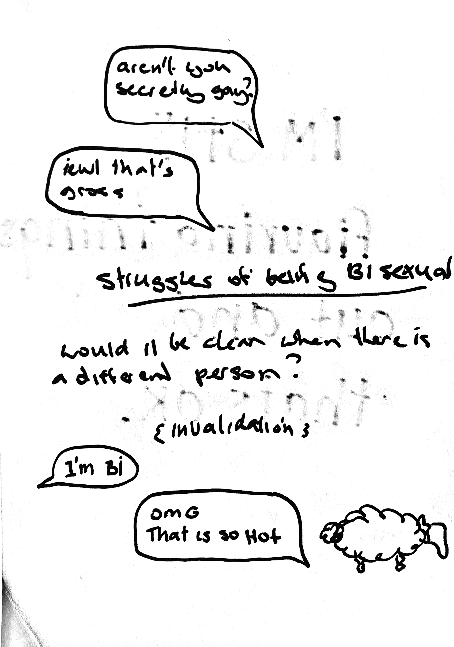
A response to how bisexuality is constantly misunderstood and/or brushed off. Not just by straight individuals but sometimes even within the LGBTQIA+ community. Most bisexual folks frequently hear things like, “Pick a side,” or “It’s just a phase”, or “You’ll figure it out eventually”. These comments aren’t harmless. They can chip away at someone's confidence and identity.
My goal? To spark change, to push straight parents, friends, and partners to rethink their reactions. With a mindset shift, they can create a safer, water space for someone coming out. This project. Asks people to question their prejudice.
Motivation
When you’re not straight - which is often seen as the “norm” - it feels like you have to come out again and again. I’ve experienced some interesting reactions throughout my journey, and some responses even made me question my sexuality all over again: Is it a phase? Am I confused?
There is also a double standard. Responses change based on gender, but the root stays the same: there is a massive lack of understanding.
Bisexuality is not confusion, it isn’t indecision. And it definitely isn’t a phase.
Final posters
Process
I started by researching illustrators like Jip van den Toorn, Bobbi Oskam, Phillip Lindeman, Joost Stokhof, and Max Kirman. Their boldness and honesty inspired me, and I knew I wanted to make something personal. I just didn’t know what shape it needed yet.
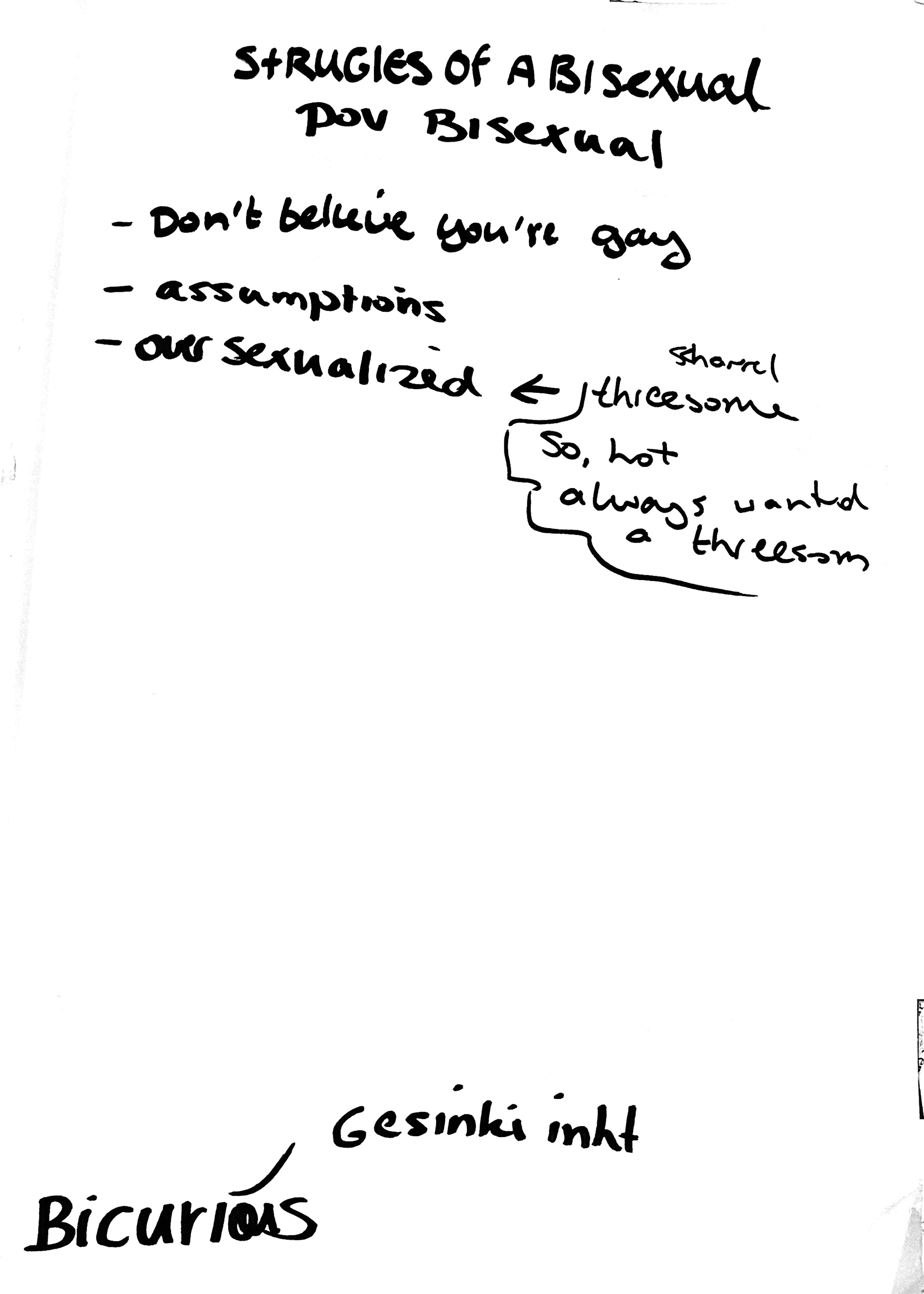
I sketched a lot. I circled the themes that felt personal.
I collected real reactions I’ve heard, and other friends of mine shared as well. And I turned them into this project.
First Sketches
At first, I grouped them into three categories (reactions to a woman, a man and a gender neutral person). I tried shaping those into a narrative but quickly realised I was trying to say too much at once.
So I stepped back.
What's the real story?
Not just the reactions themselves, but how easily people can invalidate someone’s identity. Often, they don’t even realise it.
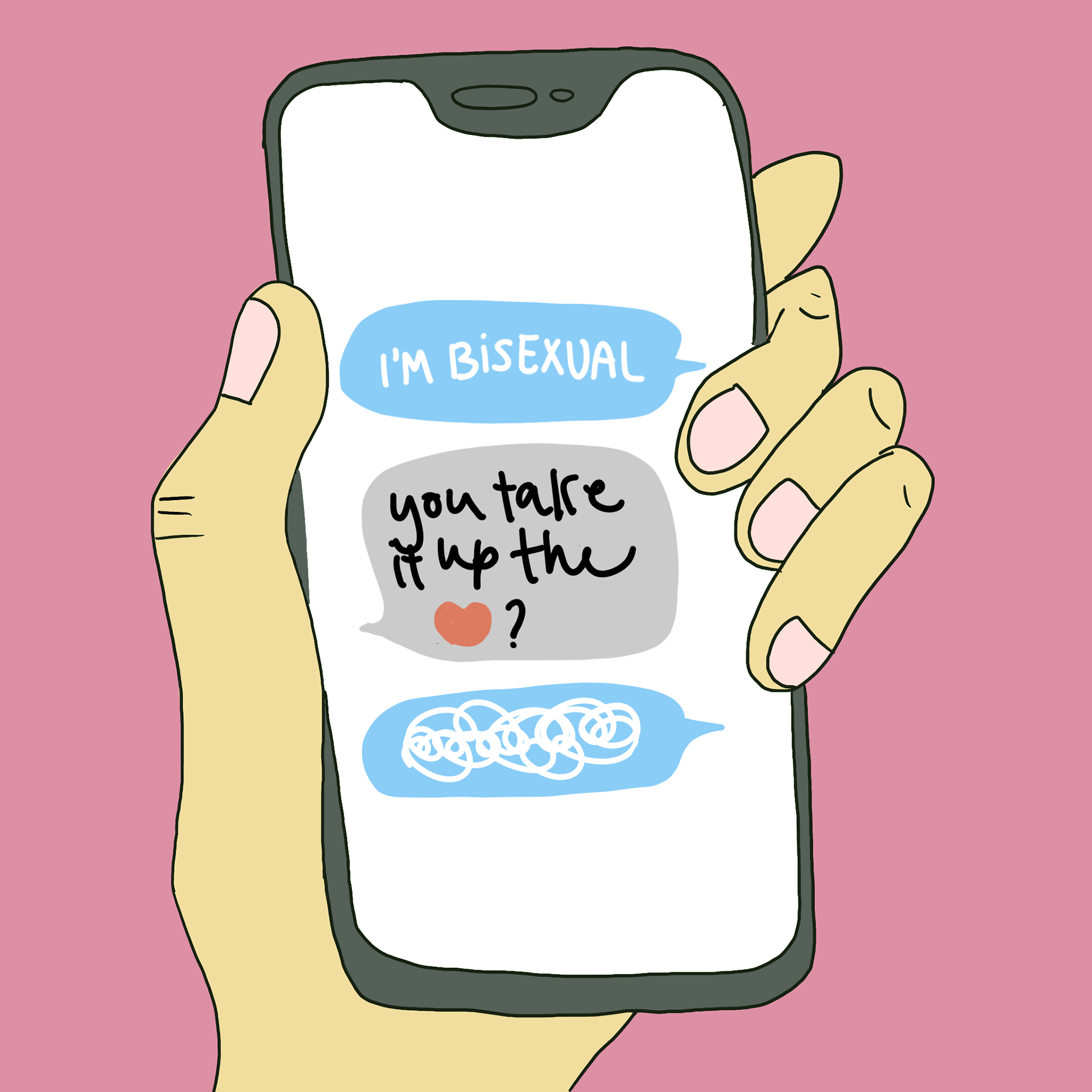
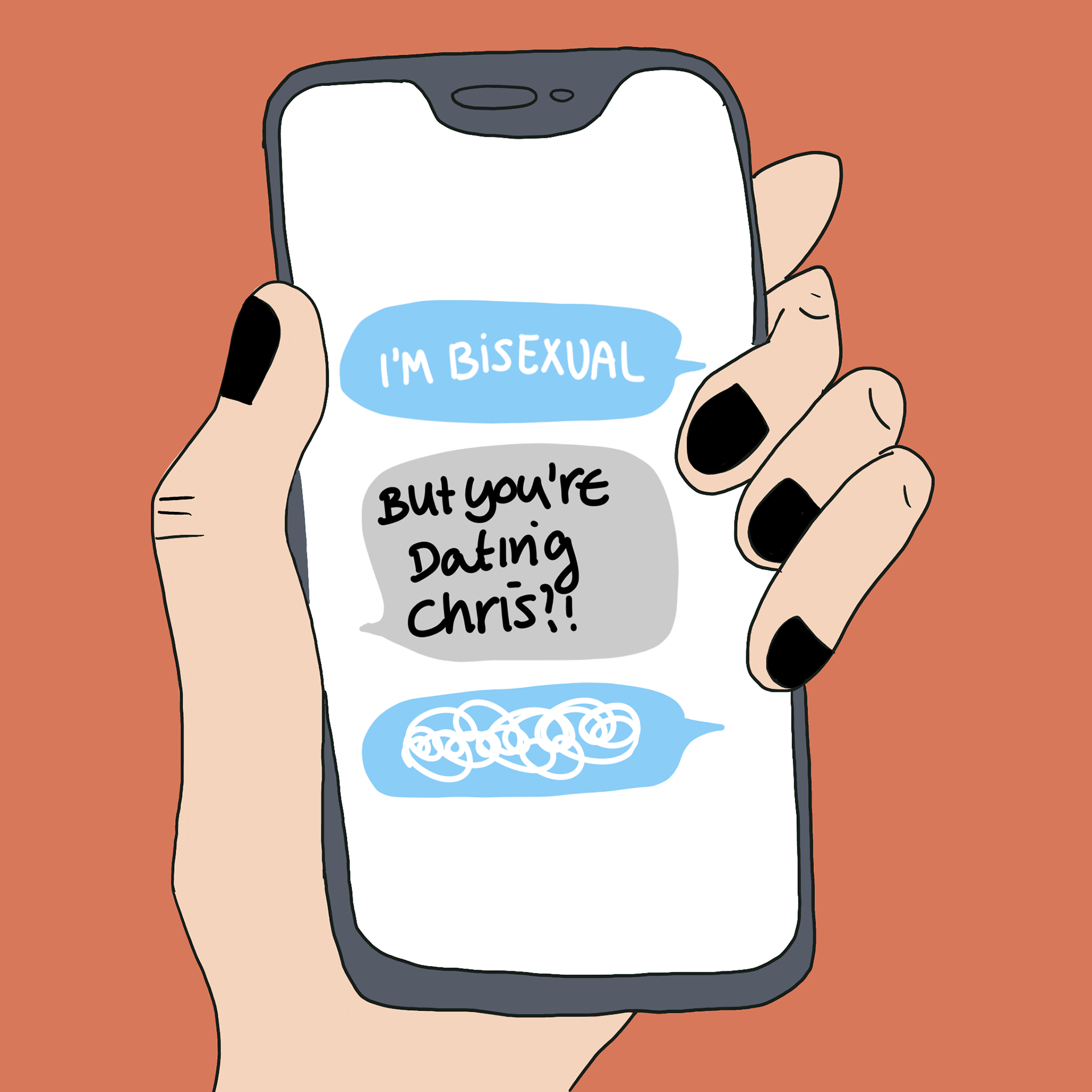
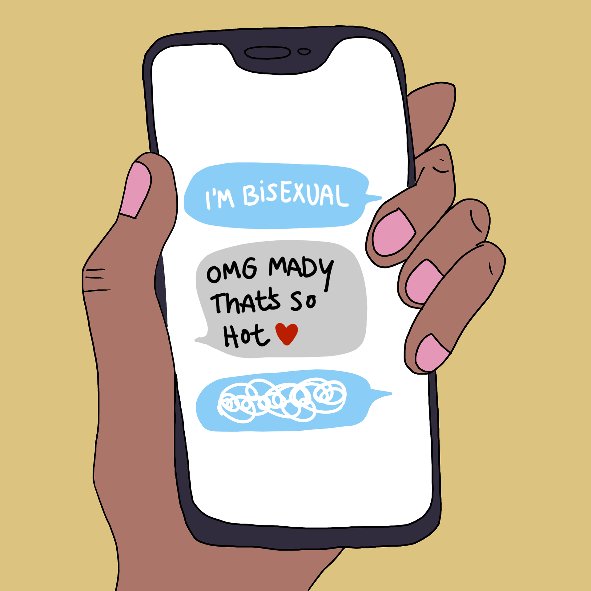
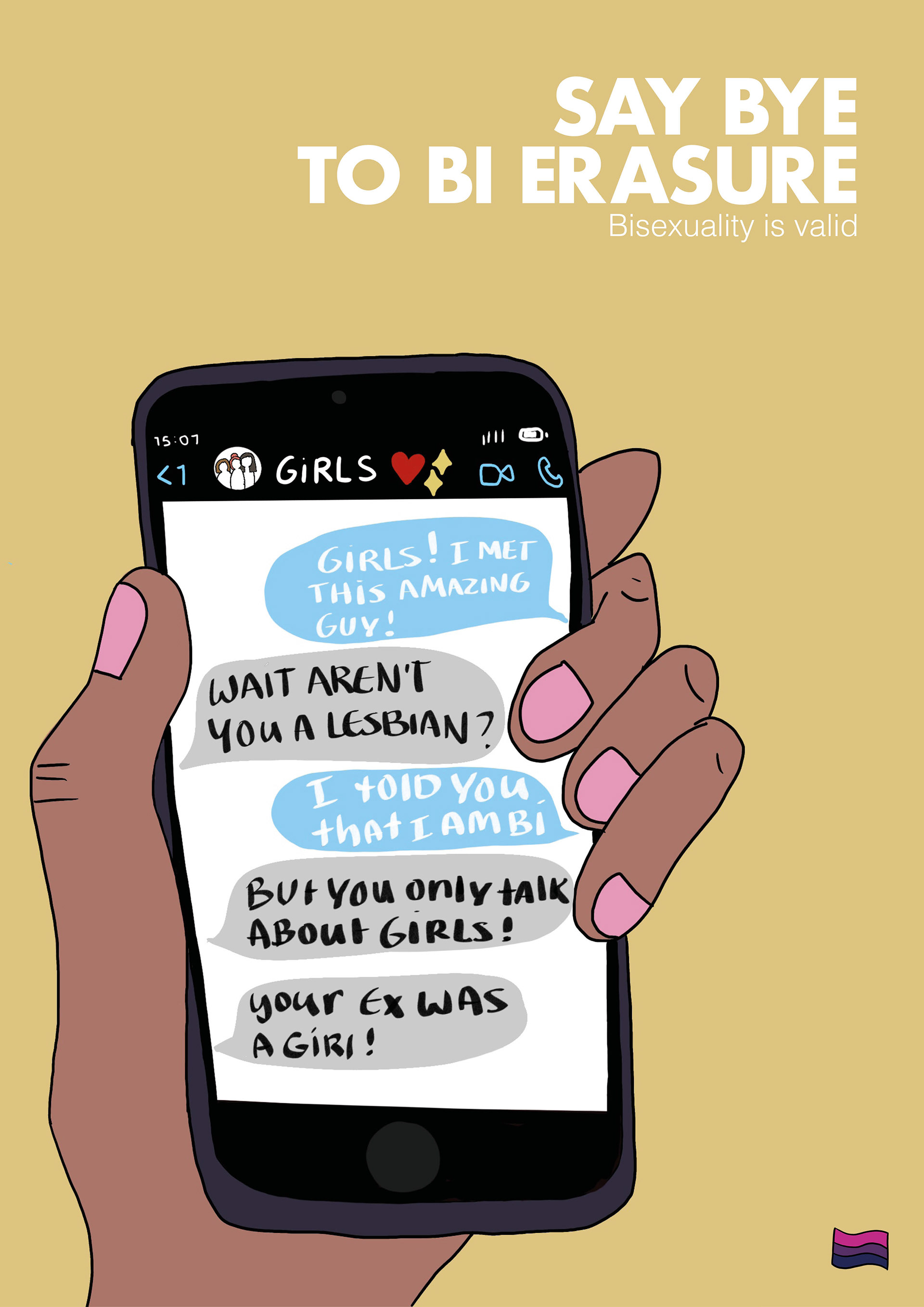
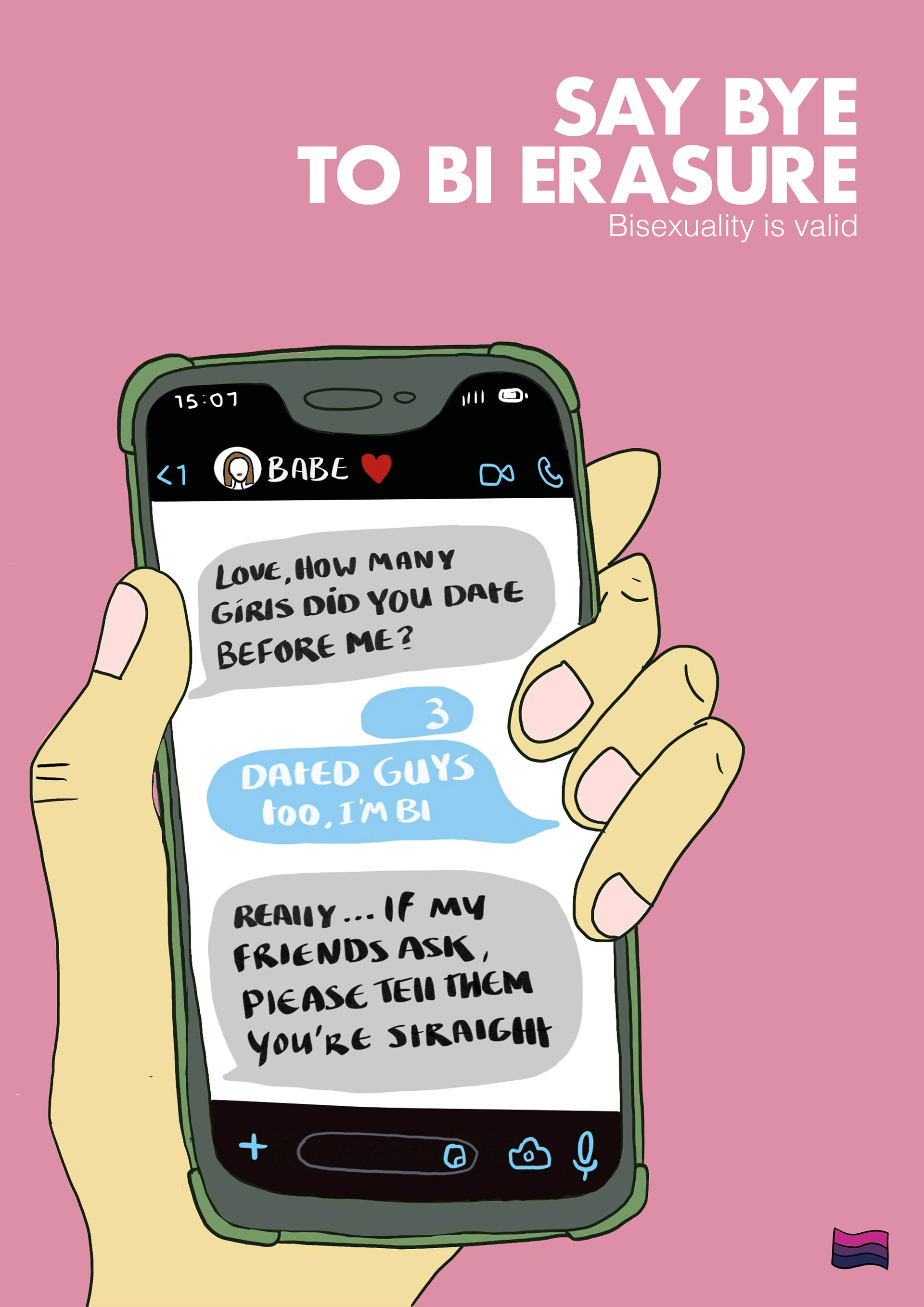
That's when the texting format came to mind. It's modern, relatable and people are unfortunately braver (and harsher) behind a screen. The first images explored how one message can and entirely different depending on the response.
The person behind the message
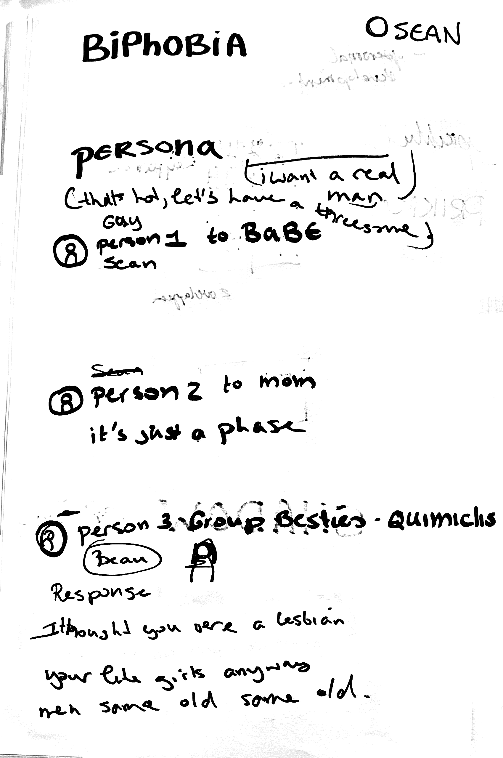
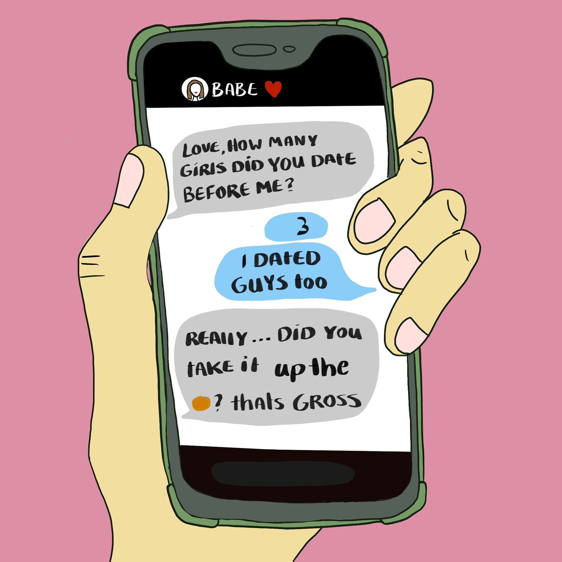
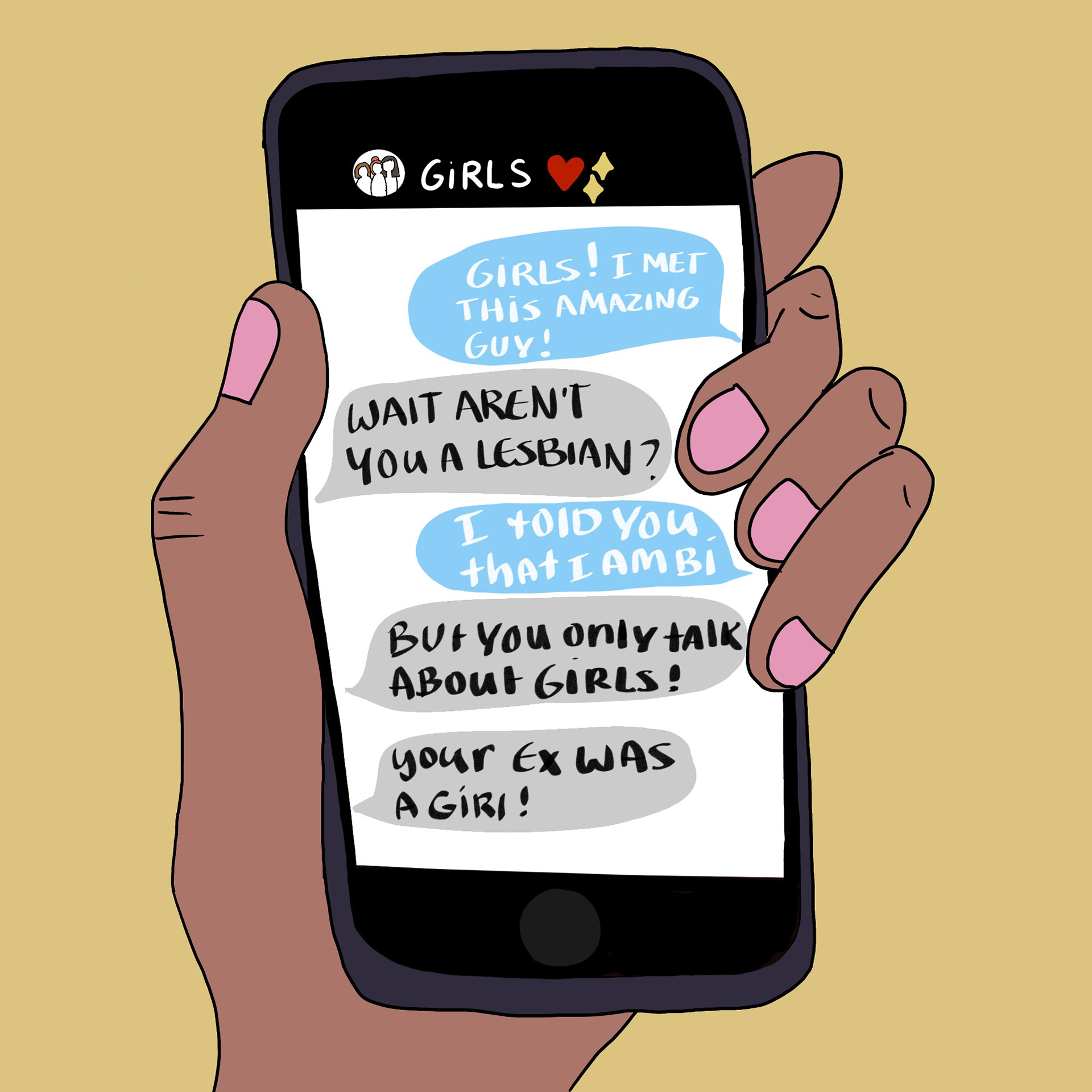
Sean is texting his Girlfriend.
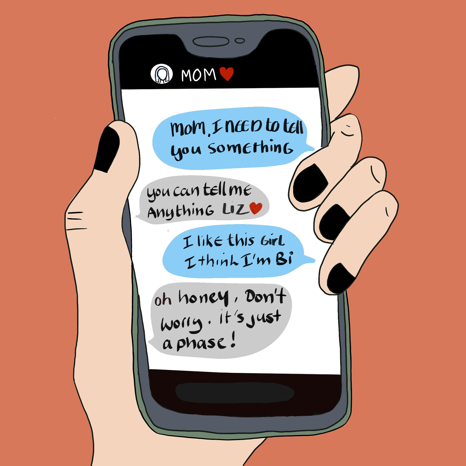
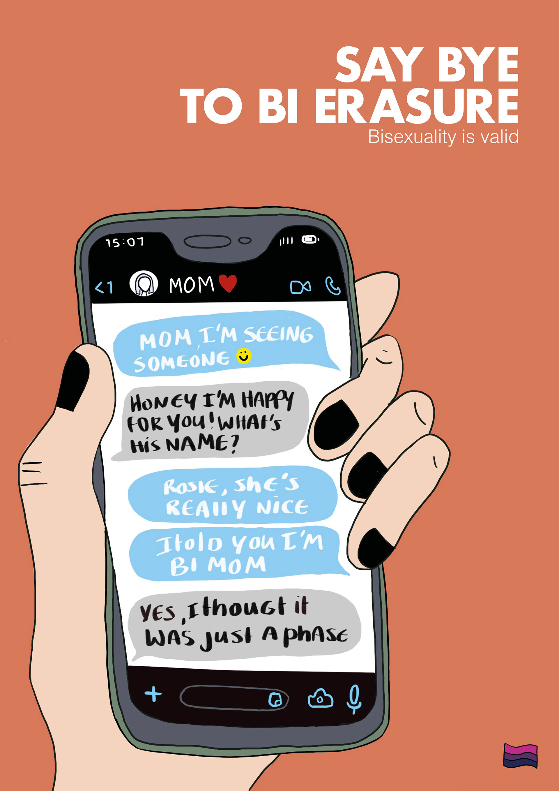
Liz is texting her mom.
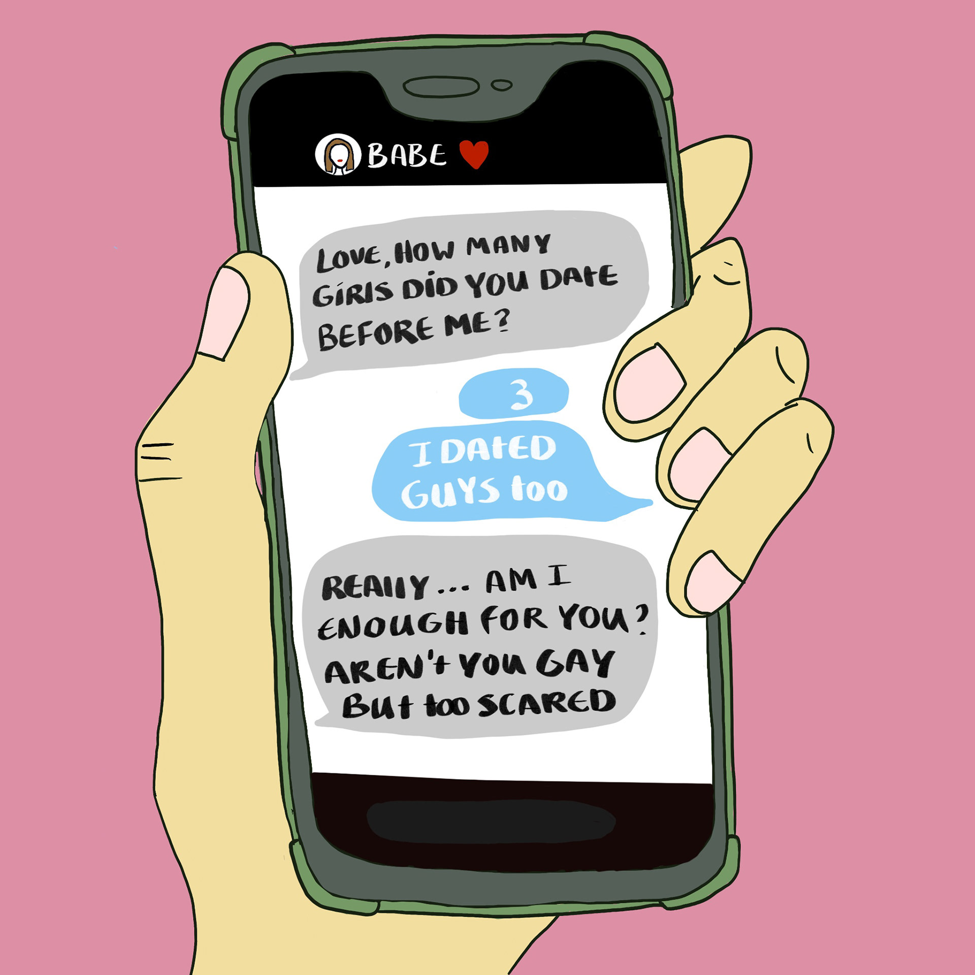
Beau is texting her friends.
What do I want to tell my audience?
I found they lacked personality. No clear POV, they didn’t have an identity and not much context.
So I built three personas. I redesigned their phones to visually separate their stories. I also drew myself as part of an exercise. As I developed the copy, I realised the stories weren’t aligning thematically. That's why I reworked Sean’s scenario to match the deeper theme: identity being dismissed or reduced to stereotypes.
Strategy and Copy Writing
Across all three conversations, one thing kept happening: people where being invalidated. Their sexuality was reduced to assumptions or stereotypes.
There is already a lot going on with the imagery where I wanted the primary focus to be, which is why I kept the copy sharp and minima
Communication goal
Shifts people's attitudes toward bisexuality and challenge them to end bi erasure.
Insights
People feel pressure to “choose,” as if liking more than one gender is impossible.
Many still don’t understand bisexuality beyond misconceptions or bias.
Challenge people
With the headline, I actively call people to take action. An invitation: say bye to bi erasure.
Final images

Conclusion
This project taught me how to combine strategy and visual communication to amplify a socially driven message. I shifted from a design-first approach to a strategy-led one to ensure the copy, tone, and visuals aligned and landed with impact. It showed me how personal experience can fuel strong, socially conscious work, and it reinforced my drive to make work that pushes for visibility, nuance, and change.